Our friend Marty (@turtleknife) posted a fabulous ScreenFlow yesterday on how to create your own unique transitions, where he shows us, step-by-step, how to create your own customized transition.
This got me thinking about the importance of transitions, and how we can use them to enhance our ScreenFlows.
Most ScreenFlows, after all, are ‘stories’. Whether you’re working on a software demo, a tutorial, or a short home movie about your trip to Hawaii, you are telling some sort of story. The intent of the editing process is to enhance that story. There’s no correct way to use transitions, it’s a matter of taste and opinion. But, when used appropriately, a transition can dramatically enhance the impact of your story. When used inappropriately, it can be awkward and distracting.
Here are a few tips to keep in mind when using transitions in your ScreenFlows:
1) Keep it simple: Stick to just a few types of transitions
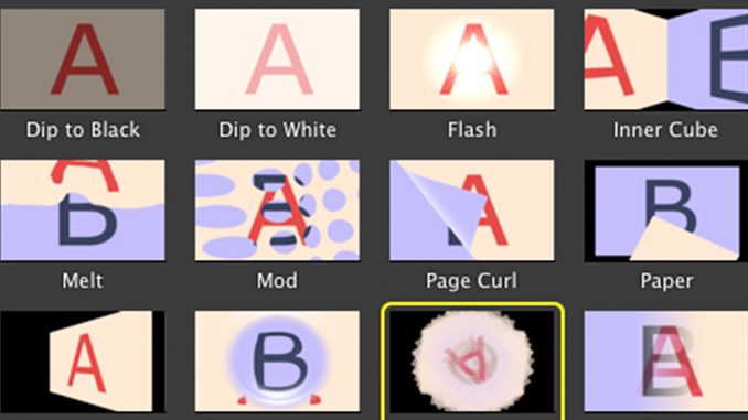
Just because ScreenFlow has 16 different transitions to choose from does not mean you should try to use all of them in one project! I’ve seen many a screencaster try to show off all their tricks in one 3 minute movie! The result is a distracting display of transitions that do nothing to help tell their story.
In general, most stories can be told with short dissolves, a wipe or with simple fades in/out. Try to stick with a few basic transitions within any one project, and keep them consistent and simple.
2) Keep it smooth: Keep transitions as unnoticeable as possible
Great video editing is about creating maximum emotional impact without being noticed. People remember great Hollywood movies for their emotional impact not for their video editing transitions – and this applies to ScreenFlows as well. Try to keep your ScreenFlow transitions as smooth and as unnoticeable as possible. Long, drawn-out transitions, or transitions that seem clumsy or poorly implemented hinder the flow of your story. It’s easy in ScreenFlow to apply a smooth transition, but be aware of how long your transition lasts on screen, and how noticeably it disrupts the flow of your video – and keep it to a minimum.
3) Add the “BAM!”: Add occasional pizazz when you want impact
If you exercise this discipline in keeping your transitions simple and smooth, when you do choose to use a fancier transition (like Marty‘s mentioned above), it will really add impact to your video. It’s OK to call attention to something with a transition. Just be judicious in how you use this powerful feature, or again, you risk distracting your audience from your main story.
In professional video editing, the rule of thumb is generally “less is more,” and this should carry through to your ScreenFlow editing. Just keep it simple, and smooth (with the occasional “BAM!”), so that your style matches your content and aids in the storytelling process, without hindering your viewer from being drawn into your story.


Probably one of the simplest transitions I’ve seen was a single white frame between two scenes. I had to deconstruct the movie going through that section frame by frame in QuickTime Player Pro (arrow keys) to see how this was done. I was expecting something more complex so finding only a single white frame was a surprise.
Frank,
Interesting. So did the video cut abruptly to a white frame, then cut back to the next scene? Or was there a (dissolve or other) transition to the white frame?
Dip to white is very similar and honestly a little smoother for this type of transition. I use it all the time in my demos to show a passage of time.
The “blip” effect of going to a white slate is used a lot nowadays.
Using Keynote or PowerPoint to create unique transitions is another good source. Either capture them in action with ScreenFlow or use their video output options.
Frank,
Yes, absolutely agree – Keynote or Powerpoint can do some great animations and transitions.
Above the article mentions to keep it simple with transitions
I do want to use either a short dissolves or simple fades in/out.
But screenflow 7 doesn’t have fades or simple dissolves, where can I find them